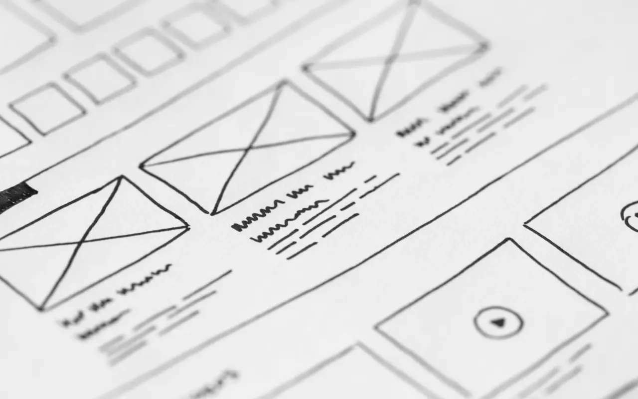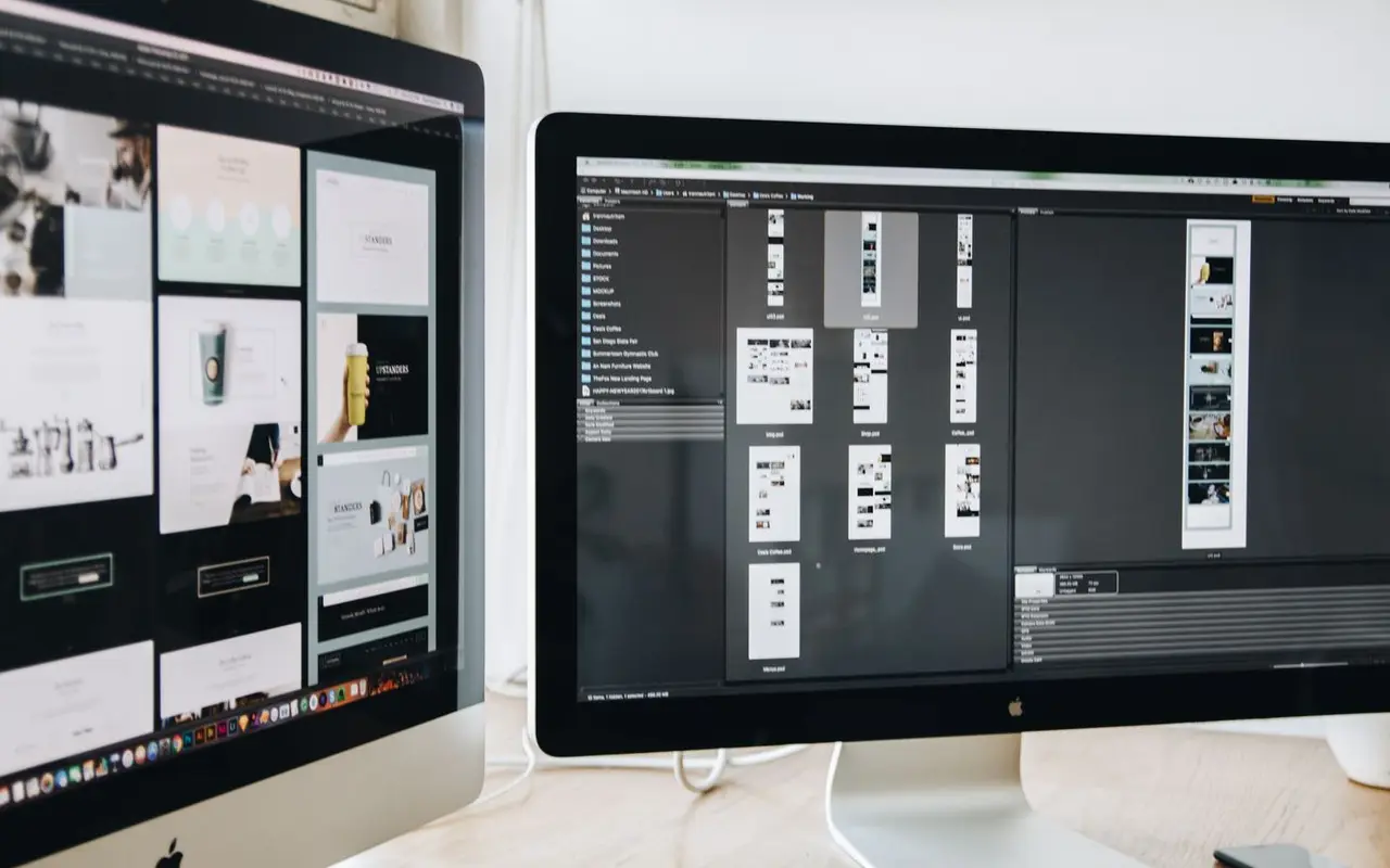
Accessibility gets difficult when a team treats it as a final test. By then, the navigation, form structure, and visual hierarchy are already fixed. A first design review can catch many issues while changing them is still easy.
Check the path, not just the screen
Choose a real task, such as finding a service and sending an enquiry. Can someone understand the page headings? Is the link label clear without the paragraph around it? Does the form explain what is required and where an error occurred? A screen can pass a color check and still be impossible to use.
Use semantic HTML when implementing the design. A button should be a button, a link should go somewhere, and headings should describe the page structure. Built-in browser behavior gives keyboard and assistive-technology users a sound starting point.
Include different ways of using it
Review keyboard order and visible focus. Zoom the page to 200% and check that text and controls remain usable. Test on a narrow screen. If a diagram carries information, provide the same information in text. Decorative images can have empty alternative text; informative ones need a useful description.
Automated checks help find missing labels and contrast problems, but they cannot judge whether instructions make sense. Include a manual review and, when possible, people who use assistive technology. Accessibility is a set of product decisions made throughout the build.
Further reading: MDN: HTML as a basis for accessibility; W3C: What's new in WCAG 2.2.